Final Major Project: Part 2!
Seeing as I plan to make a comic for my final piece, I figured that it would be beneficial to do a scene study on "Spider-Man: Into the Spider-Verse" to get more of a feel for how scenes are laid out in comics and comic book style movies. I had alot of fun doing this actually, even though the drawings are small and were done relatively fast, I think that they came out looking nice and it was a good exercise to help me feel more confident in drawing in pen.

Following on from the study I did, I tried doing a first attempt at the first two pages of my comic, this really helped me later down the line because it helped to get my initial ideas out of my head and onto paper, so that I could think about the sizes and shapes of the panels later.

After doing the first draft of my comic pages I decided that I should probably give my characters some colour. I wanted the tall character to look out of place compared to the rest of the city, having brighter warmer colours rather than the purples and dark blues I plan to use for the background and surroundings. On the other hand I wanted the moth looking character to have a bit of both, to fit in with the city but still ever so slightly out of place; so I made their body the darker purples and blues while their wings are neon and almost luminescent.
On the right hand page I continued to draft the ideas for my comic. I added a series of panels where the moth bumps into the taller character, not seeing that they had stopped walking, although this scene seems pretty insignificant and doesn't seem to show any real purpose, I really like it because it kind of shows the characters personalities. It shows one of the characters making a tiny mistake, which I rarely see in official comics but I think small, candid scenes like that one can make a real difference in bringing characters to life.

There are a few tiny small details that I aim to include in the final result of my comic which are: the recurring wanted posters hidden in the background and the theme of eyes everywhere. Its an idea I had which I am yet to experiment with but I want to convey the idea that in the city they live in there is virtually no place to hide and they are always being watched. Its a theme that I have briefly toyed with on a few of my first sketches when thinking about this project.
On the right, I did some printing. I wrote my thoughts on the page so that I wouldn't forget them. Something I want to remember when printing in the future is that whatever you print will come out BACKWARDS so your design should be done backwards if you want it to come out the right way.

I made these little paper dolls of my characters so that I could move them around and see what different poses I could put them in. This has been helpful when I've been drawing my comic because I can actually see in front of me how it is supposed to look or if a pose feels awkward. I use blutack to keep them in place in the book and after I have posed them so they don't get blown away by the slightest gust of wind.

I started to research different ways I could get my comic printed and found a website: https://www.newspaperclub.com/ who offer a range of different ways to print your work for more affordable prices than other places. They sent me a free pack of samples so I could compare the different sizes and see the different types of paper that they had to offer. I decided that I would want a mini size zine for my comic book, something on the smaller side since I am only doing the first few pages.
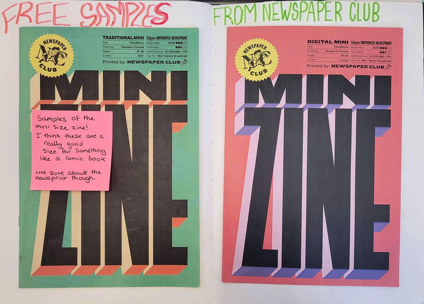
I wrote on sticky notes throughout the zines, documenting my thoughts and what I saw in each one and the types of paper.

I don't have much to say about this one... I just thought it would be funny to cover the answers to the crossword with Tax Man.

Here I did some calculations about how much it would cost to get 10 minis printed.

In the samples they sent out, they also had some really helpful guides for people who are printing for the first time. They're essentially a step by step guide, telling you everything you need to know before you dive off the deep end and get your work printed.

Again, I thought it would be funny if I covered the answers to the crossword.

I laid all the samples I got out on this page so that I could compare the differences side to side. There aren't any huge noticeable differences apart from the salmon newsprint maybe, but then when you look a bit closer you can see the differences in the printing methods. For example the traditional tabloid on the left page is alot more grainy compared to the digital tabloid next to it.

Here are some more examples of the above samples.

These two samples were my favourite papers. They felt very smooth and more sturdy compared to the other ones and the images on them were brighter, and seemed more colourful.

Here the pages are unfolded and you can see how much detail they capture and how clear and bright the pictures are on the paper.

I found this comic sample while out in a bookshop in York, I chose my favourite pages and analysed the layouts and design. I made sure to include the Authors' names at the bottom of the page, not wanting to just use their work uncredited.

Alot of my thoughts about this page are written below, I don't have much else to add to it.

I found this artist one morning when I was scrolling through instagram on the bus to college. I liked her work so much that I researched about her there and then on the bus before going to tesco and buying black pens in various line thicknesses so that I could try working in her style myself.

My tutor let me borrow his ink and gave me some nice watercolour paper so that I could try and see what it was like REALLY working like she does. I tried making it so that the patterns are in place of shading. I really like this piece but it was difficult to do at the time because I was using a full size paintbrush when the artist above uses much smaller, finer paintbrushes. I especially like how I did the smoke effect around the moth character.

After the above piece I started working on this big piece which was focused on the moth like character. I was originally going to have every different part of their body be a different pattern but then figured that it would begin to look a bit crowded, so I used all the same type of pattern for the body, arms and head. The same pattern for the wings, but done with varying line weights. I also used dots to try and shade over the patterns in a way that wouldn't distract from the drawing.
It was a messy process but I really enjoy it!


